When talking Amazon optimization tips, you (probably) think of your listings as they might appear on a desktop browser. While you’re not wrong, you’re neglecting a major trend in online shopping: mobile.
Mobile has become a major player when it comes to online shopping and the world of ecommerce. Smartphones are forecasted to impact one-third (or over $1 trillion) of total U.S. retail sales during some part of the customer’s journey in 2018.
And if you think this doesn’t affect Amazon shoppers, think again. During the 2017 holiday season, shopping on the Amazon app increased by nearly 70%. As of February 2018, Amazon took the title of most popular mobile lifestyle and shopping app in the U.S., ranked by monthly mobile users. They had a whooping 133.34 million mobile users access the app during that month.
Now that we see the impact that mobile is having on online retailing, it is no longer enough to simply focus on desktop optimization. If you do, you’ll miss out on your fair share of potential sales opportunities.
When it comes to desktop vs. mobile, there are some differences on how the content is displayed to the user, particularly in the title, product features, description and image sections.
Title
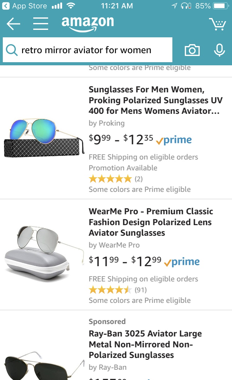
We all know that a smartphone screen is just not as big as a desktop screen. Therefore, when a person searches in mobile, their experience is a bit different. If the title is too long, it will be cut off in the search results.
As you can see with the below mobile search, the title of the first listing is cut off and you have to actually click into the listing to see it in full.
Now let’s take a look at the same search conducted through a desktop. The entire title is shown.
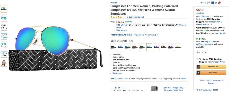
When creating your title, you want to ensure you are putting the most important keywords first so they are not cut off. That being said, you want to avoid keyword stuffing. The title should be clear, concise and easy-to-read for the user. Another way to make the title more user-friendly is to use dashes to commas to separate out different keywords.
Bullet Points (aka Key Product Features)
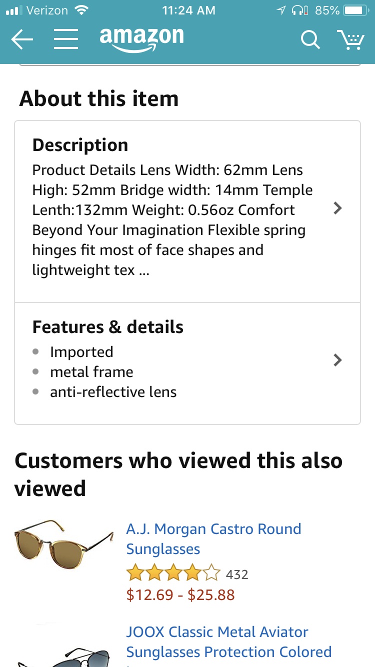
Once you actually click into the listing, you’ll notice that you’ll have to scroll past the buy box to view both the description and the bullet points. On a desktop, the bullet points are displayed prominently on the screen next to the image.
Mobile:
Desktop:

You’ll also see that on mobile only the first 3 bullet points are listed without you having to click to see more. Needless to say, put the most important bullet points first.
In order to make them stand out, you can even use capitalization for the words at the beginning of each bullet points.
Description
Another interesting aspect of mobile vs. desktop is that on mobile the description is displayed before the bullet points. If you’ve been neglecting that description field, it’s time to give it the attention that it deserves. On mobile, the description cuts off at about 201 characters though so make sure you include the most important, compelling information first. The user has to click on it to see the rest.
The description preview shows all of the information crammed into one paragraph. Users don’t see it formatted out until they actually click to expand on the description field.

Images
Images appear front and center on the mobile screen. However, a smaller screen means that the images will also appear smaller. Make sure you are using high quality images that are not pixelated once you zoom in on them.
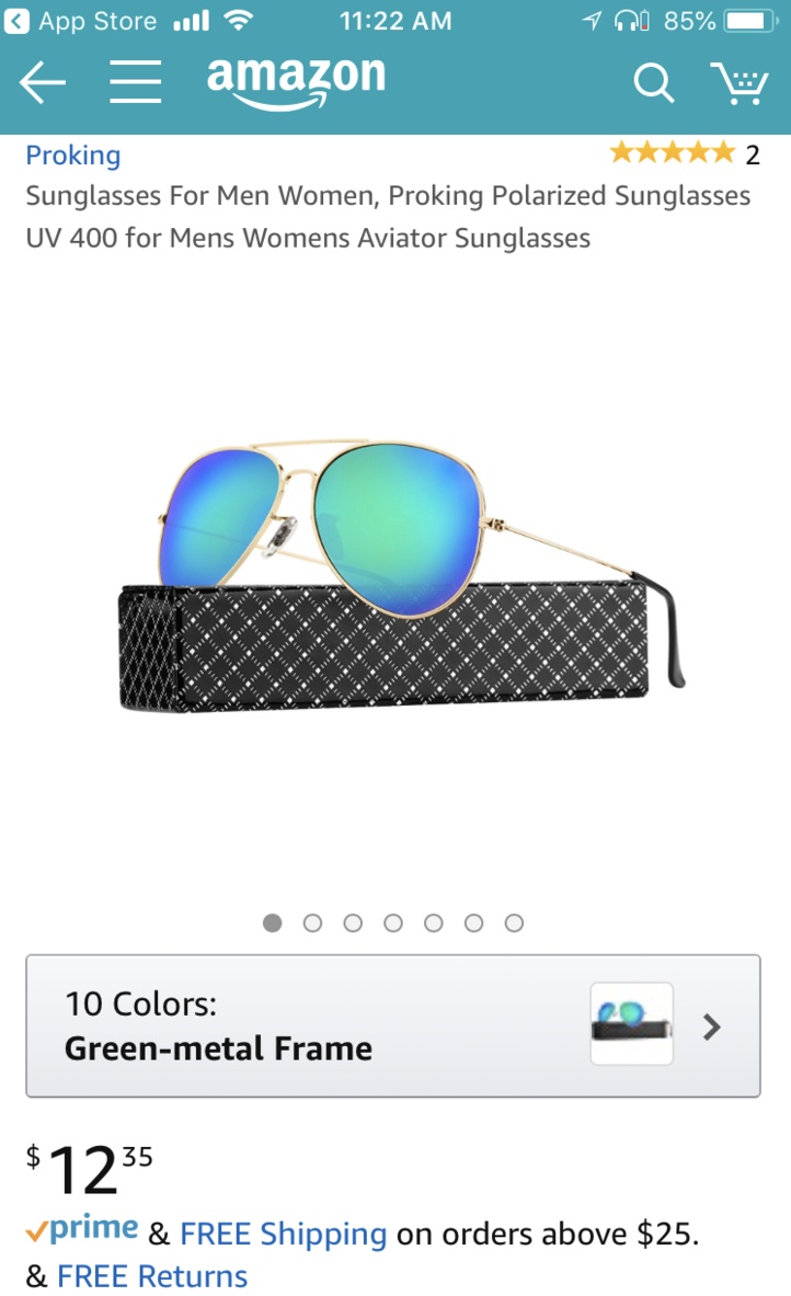
The thumbnails of additional images do not appear on mobile. Those users who don’t automatically have the intuition to swipe left may miss out on your additional images. As always, choose your main image wisely and follow Amazons image guidelines.
Summary
Don’t leave your mobile shoppers hanging. Optimize your listing to take advantage of all those potential sales. Don’t worry though, optimizing for mobile shouldn’t hinder the desktop experience. If anything, it should improve for both desktop and mobile users alike.


%20).png)

%20).png)
